
Minimalism in User Interface Design
Less is more: exploring the principles of minimalist design and its impact on user experience.
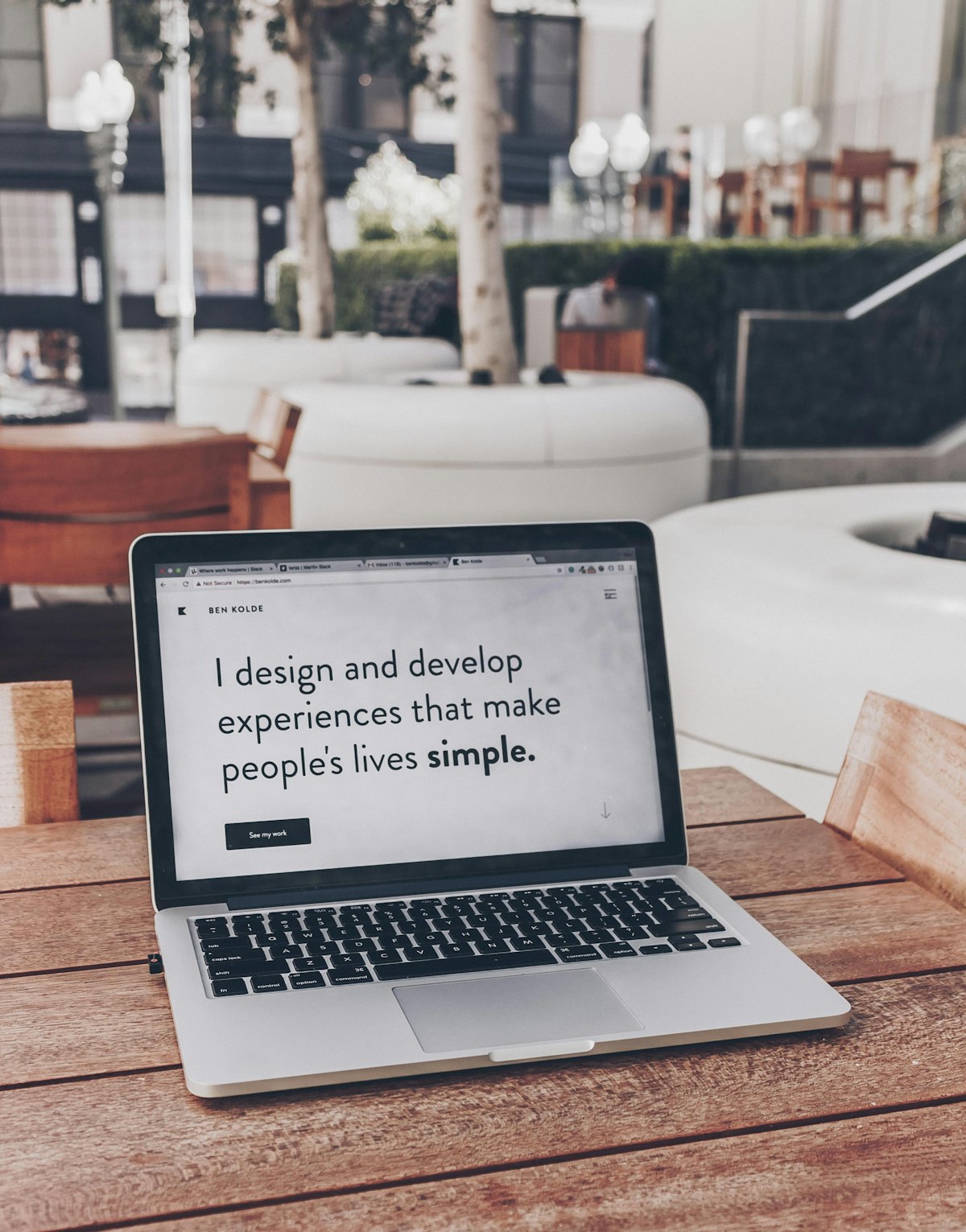
Minimalism in interface design is widely misunderstood as a style—white space, thin type, a muted palette. The real discipline is harder and less visible: deciding what does not belong on the screen at all.
Subtraction Is the Work
Adding to an interface is easy; every stakeholder has one more thing they would like to surface. Removing is where the craft lives. A minimal interface is the residue of many deliberate choices about what to leave out, each one defended against the pull toward more.
The test is not whether a screen looks sparse but whether everything on it earns its place. An element that does not serve the user's immediate goal is not neutral—it competes for attention with the elements that do.
Clarity Over Cleverness
Good minimal design makes the next action obvious. When a screen is reduced to what matters, hierarchy does most of the work: the eye lands where it should, and the path forward reads without effort. Cleverness that requires explanation has already failed.
This is why restraint and usability tend to travel together. Fewer choices mean less to interpret, less to second-guess, and less room for the small confusions that accumulate into frustration. Simplicity is a feature the user feels even when they cannot name it.
Empty Space Is Not Wasted Space
White space is often the first thing trimmed under pressure to fit more in. That instinct is backwards. Space gives content room to breathe, groups related elements, and signals importance more quietly than any border or color could. It is structure, not decoration.
An interface generous with space communicates confidence. It tells the user that the designer knew what mattered and trusted it to stand on its own without being crowded for support.
Minimalism Is a Means, Not a Goal
The aim is never minimalism for its own sake. A medical dashboard or a power tool may legitimately need density that a reading app would never tolerate. The principle is to match the interface to the task and remove everything that does not serve it.
Approached this way, minimalism stops being a look to copy and becomes a habit of mind: a constant, quiet question about whether each thing on the screen is helping the person trying to get something done.